BRANDING
Branding research and design for ETHOSA, a sustainable beauty brand offering waterless products.
English / Français
I was commissioned to work on the branding ahead of the launch of their first product: a powder based soap customers would activated with water. The dry soap would be sent as a DIY kit, customisable with three recipes adapted to different types of skin sensitivity.
Starting my research with a customer-focused approach, I pitched four different routes for the initial brand visual identity. I based the project on the interactive aspect of the product and the role customers would play as they mix the ingredients provided to create their products.
Skill Set
Branding / Creative direction / Graphic design
Adobe CC Photoshop / Illustrator / Indesign / Fresco
CUSTOMER-FOCUSED BRANDING PITCH: FOUR CREATIVE ROUTES
The Botanist: Focus on the natural ingredients
The Apothecary: Focus on the virtues and benefits of the ingredients tailored to each individual
The Artist: Focus on the freedom of personalisation
The Chemist: Focus on the chemical experiment of mixing ingredients


BRANDING RESEARCH
The Artist idea was chosen out of the four creative routes, with an earthy warm colour palette, a sans serif font and watercolour textures.
Having narrowed down the main thread, the next stage was an exploration on colours, textures, fonts and logos.
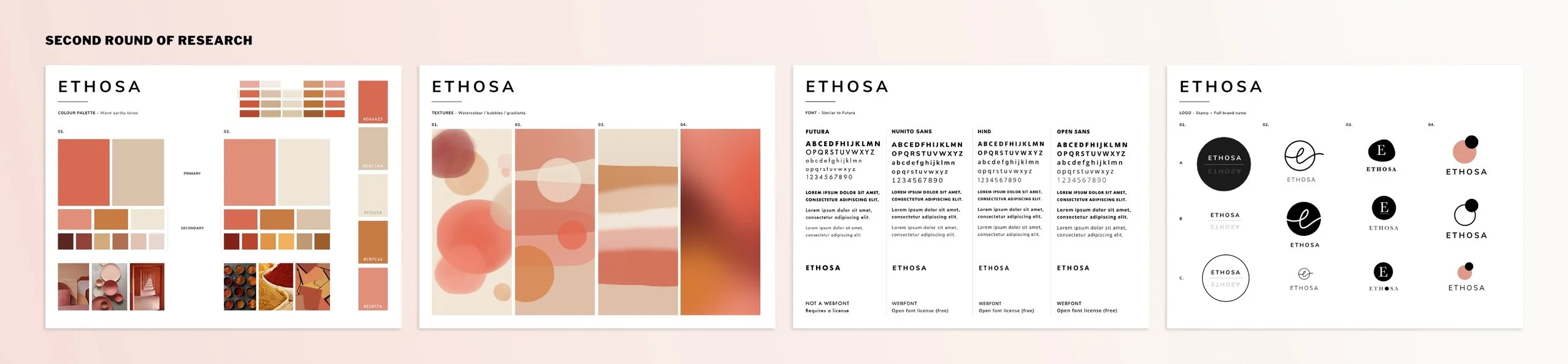
Once the font was selected, the logo and texture were the next elements to define for the packaging.

PACKAGING


SOCIAL MEDIA

WEBSITE WIREFRAMES
I was also commissioned to work on the Ethosa website. Below are the initial wireframes I put together for the main pages of the site. I then adapted those designs to the chosen website provider, Squarespace.


